
Giorgia Lupi: Sketching With Data Opens The Mind’s Eye
When does design become a story?
.This article was originally published on Giorgia Lupi's Medium page, and was also
featured on Data Points Blog, National Geographic in July 2014.
The visual representation of information plays an increasingly critical role in every situation where data and quantitative information need to be translated into more digestible stories, both for the general public and for professionals who need to make sense out of numbers.
For many readers, the word “data-visualization” might be associated with heavy programming skills, complex softwares and huge numbers for the most part, but, believe it or not, lots of data visualization designers use old-fashioned sketching and drawing techniques on paper as their primary design tool: they sketch with data to understand what is in the numbers and how to organize those quantities in a visual way to gain meaning out of it.
In Infographic Designers’ Sketchbooks, authors Steven Heller and Rick Landers offer a fascinating collection of “behind the scenes” on the creation of infographics and data visualization, featuring preliminary drawings, unfinished mock-ups and intermediate prototypes from data artists and information designers from all over the world.
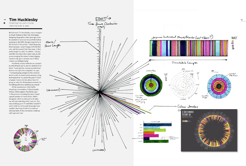

From Infographic Designers’ Sketchbooks, by Steven Heller and Rick Landers. Sketches by Tim Huckelsby.
As Heller observes in the introduction: “Making enticingly accurate infographics requires more than a computer drafting program or cut-and-paste template, the art of information display is every bit as artful as any other type of design or illustration, with the notable exception that it must tell a factual or linear story."
The fascination for what lies behind any creative process is no new thing, and the book is a terrific anthology of beautiful examples from international artists: the finished works of the are presented alongside with the designers’ working sketches; but when does exactly drawing become design? What does sketching do to a designer’s mind and how does it affect the process of working with data?
I am an information designer myself. I have been trained as an architect, but soon after my graduation I started working with information in a visual way. In my daily job I am the design director at Accurat, a data-driven design firm, and although we mostly create digital experiences with data, I still use drawing as my primary form of understanding and as my most important tool for designing every time.
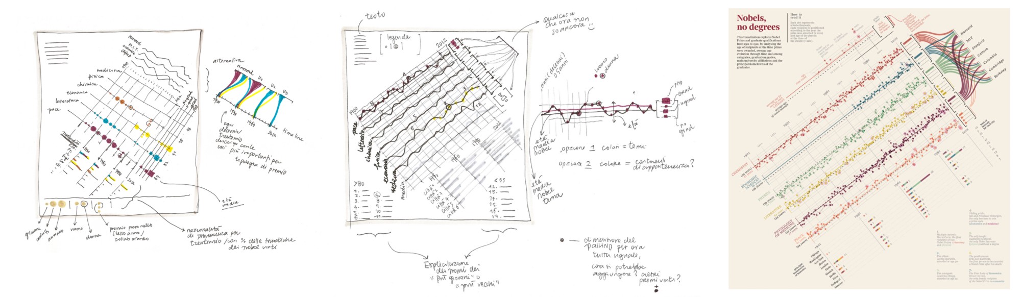
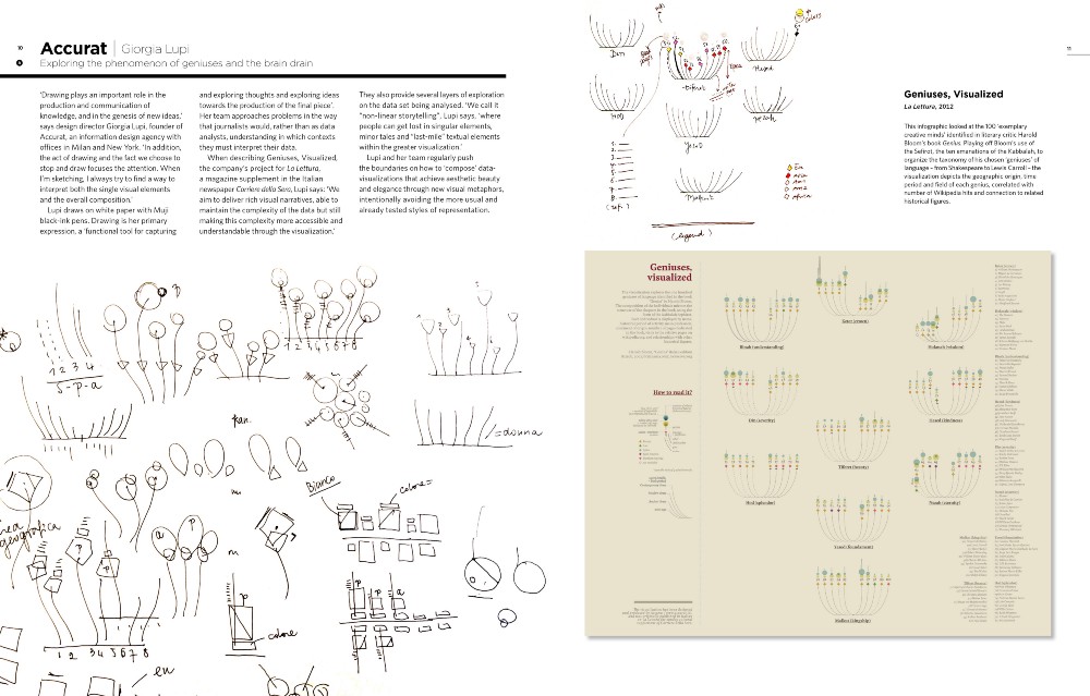
"Accurat for a Lettura, Corriere della Sera, “Nobels no Degrees”, premilimary sketches and final data visualization." Sketches by Giorgia Lupi.
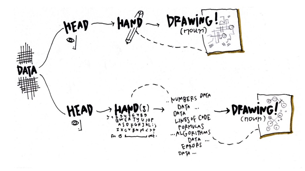
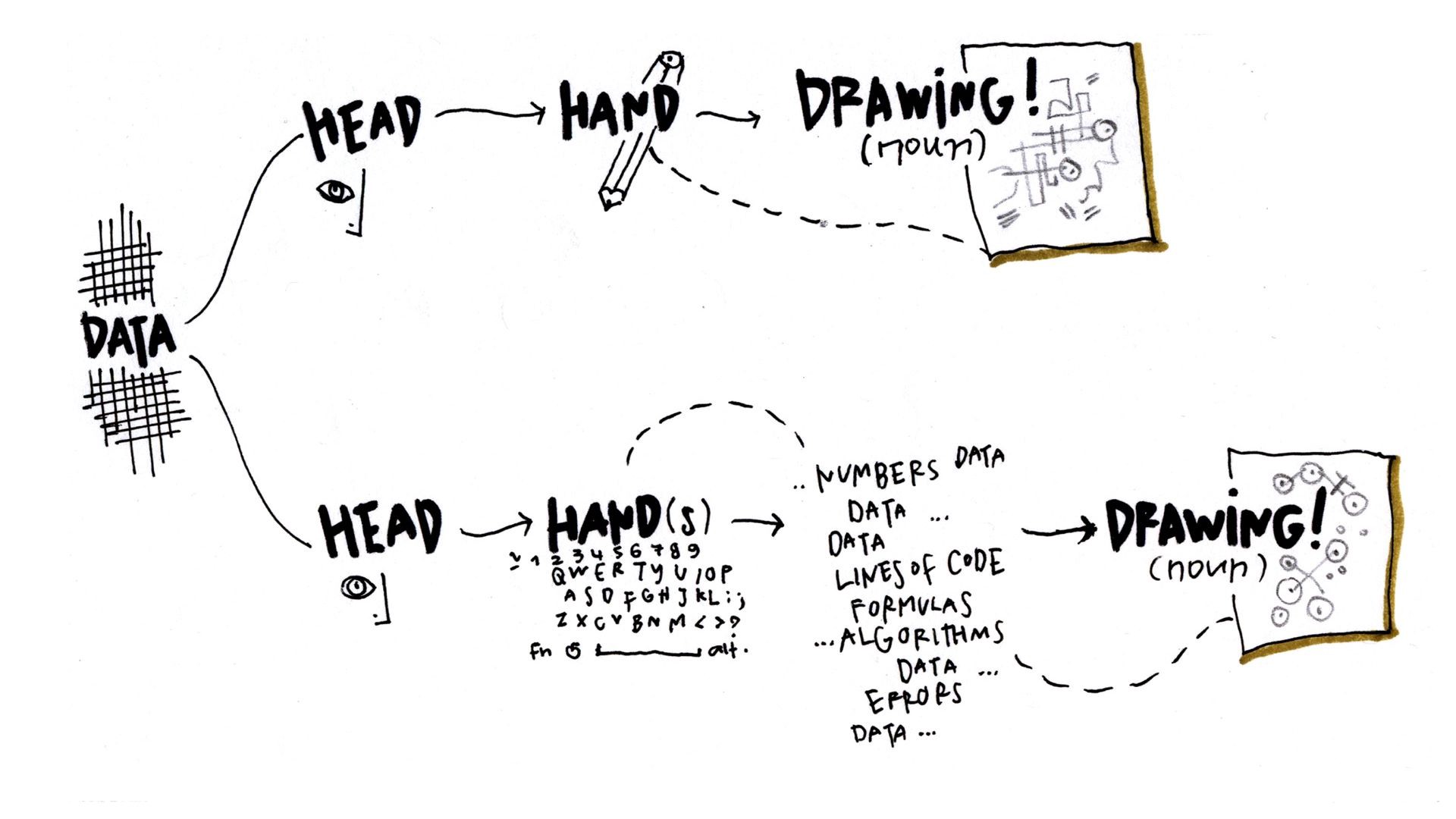
Generally speaking, drawing plays an important role in the production and communication of knowledge, and in the formation of new ideas. For many, it’s the principal method to uncover meaning in the things they analyze visually, to rationalize what their perception and senses tell them.
Drawing becomes design when you start tracing lines, symbols and structures that help rationalize thoughts and envision a possible solution to a design problem, drawing becomes design when it’s used as a tool in the process of visual planning and organizing the choices made during the development of a project.
To this regard, and specifically for data visualization design, I’ve been asked an interesting question during a podcast episode of Data Stories:
“How about the real data? When do the actual data come to the table in the process of sketching a data visualization?”
I can recognize and name three main phases where I would use drawing for different purposes:
In the very first phase of any data explorations, I am mainly interested in the overall organization of the information, in the macro categories of the data we are analyzing (i.e. the kind of topics we are investigating, the eventual correlations and the number of elements we are working with: such if they are fifty or five hundreds). I rarely use real data here, I am just giving shape to first visual possibilities about the “architecture” of the visualization while having the data in mind.
"Sketching with data: drawing to structure the architecture of the data-visualization."
Sketches by Giorgia Lupi.
On a second phase I would then focus on singular elements: the data points, to figure out which shapes, colors, features we might adopt or invent to better represent them, according to the type of variables we have. This stage is fundamental to sum up every choices we’ve made along the way, before even going digital.
Interestingly enough, in those first two phases, drawing with data can also help raising new questions about the data itself: the undefined quality of a sketch with data sometimes contributes to reveal new possible analysis to perform, analysis you couldn’t envision by only looking at the numbers.
"Sketching with data: exploring singular elements." Sketches by Giorgia Lupi.
To conclude we would generally have a final phase when, after different digital tests with the actual numbers, we would prototype our visualization either in paper or digitally to have everything in the same place: here drawing facilitates the communication processes among designers, team-mates and clients.
"Sketching with data: drawing to refine." Sketches by Giorgia Lupi.
Specifically for this visualization I have been working with visual designer Michele Graffieti; and sketching and drawing with data both analogically and digitally, has been the foundation for the whole piece. We would go back and forth several times; both of us sketching on paper and sketching digitally. And lots of the explorations have been fundamental for opening questions to the data itself. So, sketching with data is not only a personal practice, for a lot of designers is the way to go, the way to deal with data, it is their communication tool.
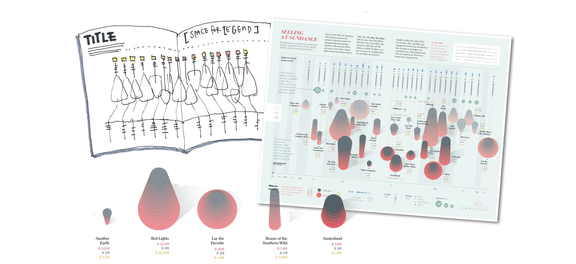
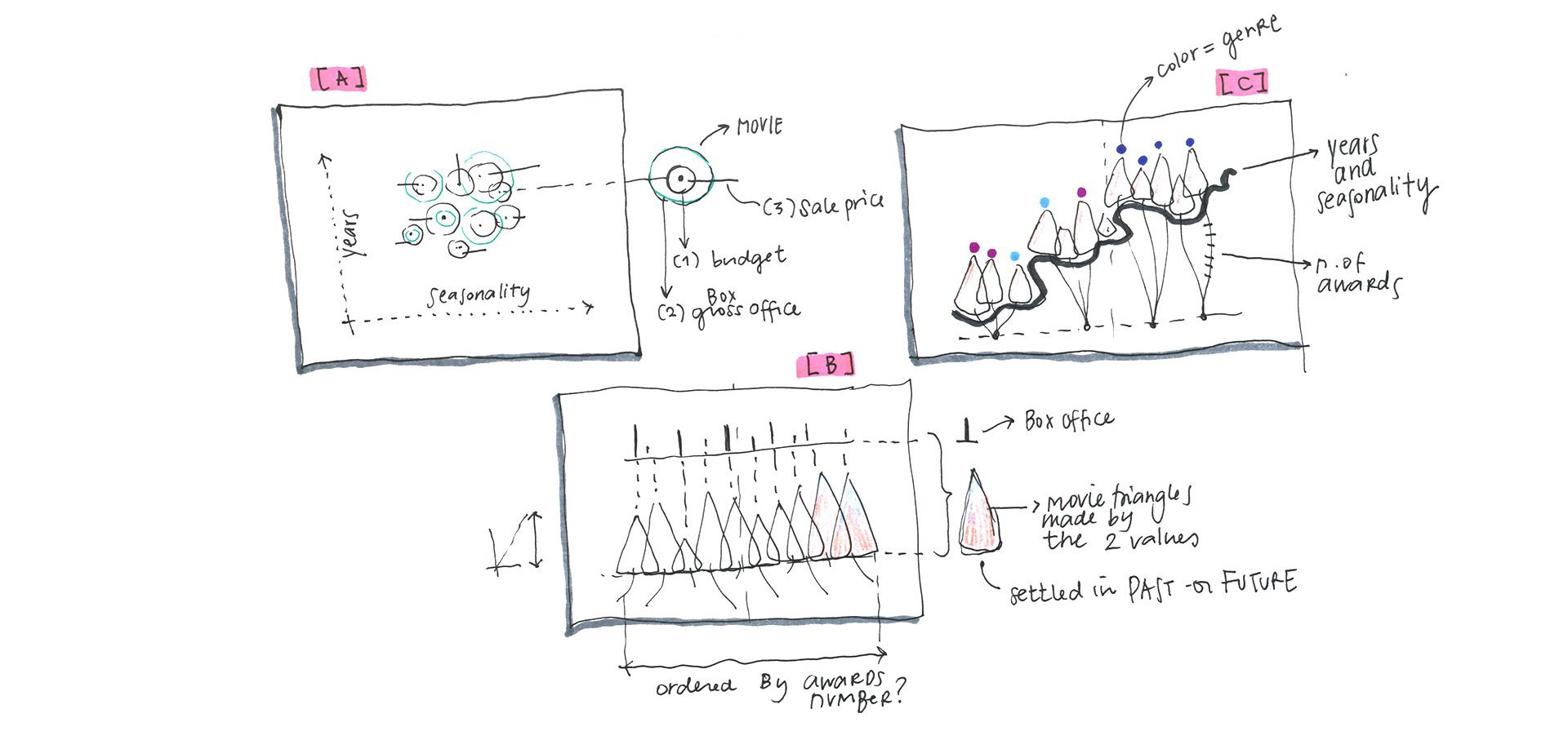
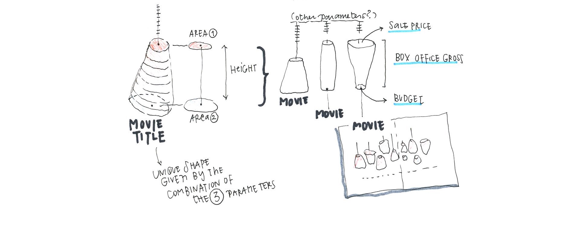
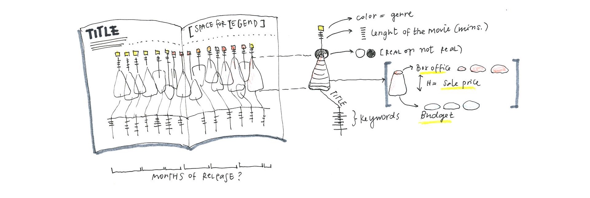
“Selling at Sundance” preliminary sketch and final data visualization
ACCURAT FOR BRIGHT IDEAS MAGAZINE — SELLING AT SUNDANCE
In designing data visualizations, a very common and sometimes misleading approach is to start from what the tools you have can easily create, and maybe also from what we — as designers — feel more comfortable in doing with these tools, but this can lead to adopt the easiest, and maybe not the best, solution to represent important aspects of the information.
As opposite, when I am sketching to explore the dimensions of a dataset, I don’t have access to the actual data with my pen and paper, but only to it’s logical organizations, and this is an invaluable asset to focus on the meaning of information, and not on numbers out of context.
Many times this self-imposed limit triggers new questions on the data itself; instead of being overwhelmed by the size of a dataset and by millions of numbers we only focus on its nature, and this often opens new possibilities and opportunities that origin from this vantage point of view.
"Sketching with data: a shortcut from your head to the final data-composition."
Sketches by Giorgia Lupi.
Drawing is a primary form of understanding reality and expressing thoughts and ideas. Drawing, in any practice, helps to freely navigate possibilities and to visually think without limitations and boundaries, it allows connections to be made, it opens mental spaces. And drawing also helps you to discover something you probably don’t have in mind yet.
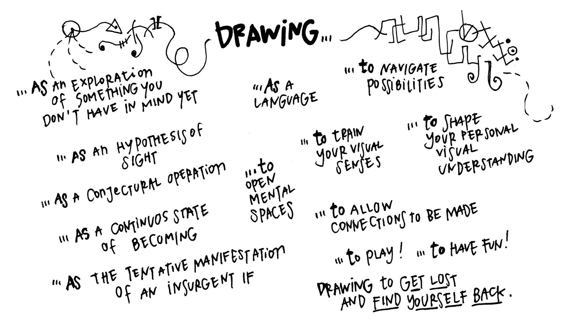
"Drawing to..." Sketches by Giorgia Lupi.
Giorgia Lupi is the co-founder of Accurat, a data-driven design firm with offices in Milan and New York where she is the design director. She received her M-Arch at FAF in Ferrara, Italy, and earned a PhD in Design at Politecnico di Milano. She relocated to New York City from Italy where she now lives. She is co-author of Dear Data, an aspirational hand drawn data visualization book you will find in bookshops in the US (Princeton Architectural Press) and UK (Penguin Random House UK). The original set of postcards has been recently acquired as part of the permanent collection of the Museum of Modern Art. She recently gave a TED TALK on her Humanistic approach to Data.
Editor: Adriana Herrera-Perhamus